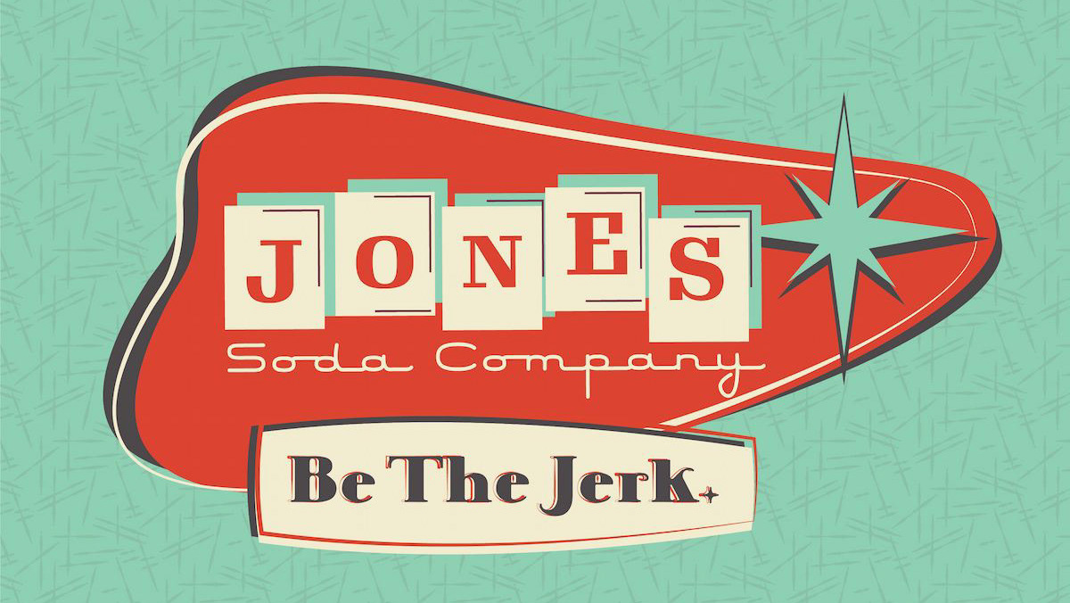
Retro Revival
A packaging concept that pays homage to the allure of retro design. Inspired by the unmistakable charm of yesteryears, this concept is a harmonious blend of creativity and sentiment.
The packaging concept's character is woven by intricate patterns that breathe life into each box. Starbursts take center stage, igniting memories of celebrations past. Organic boomerang shapes gracefully dance, reminiscent of a time when design had an effortless allure. These patterns transport us to an era where attention to detail was paramount.
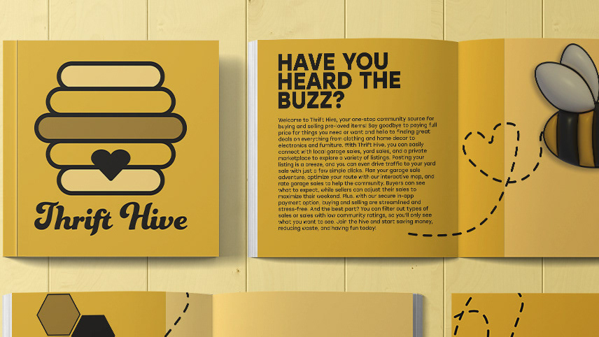
Simple line illustrations hold the essence of the treats contained within. Fruits and nuts, ice cream cones, and macarons are customized for each product package. They tell a story of taste, crafting an emotional connection between the packaging and the products it cradles.
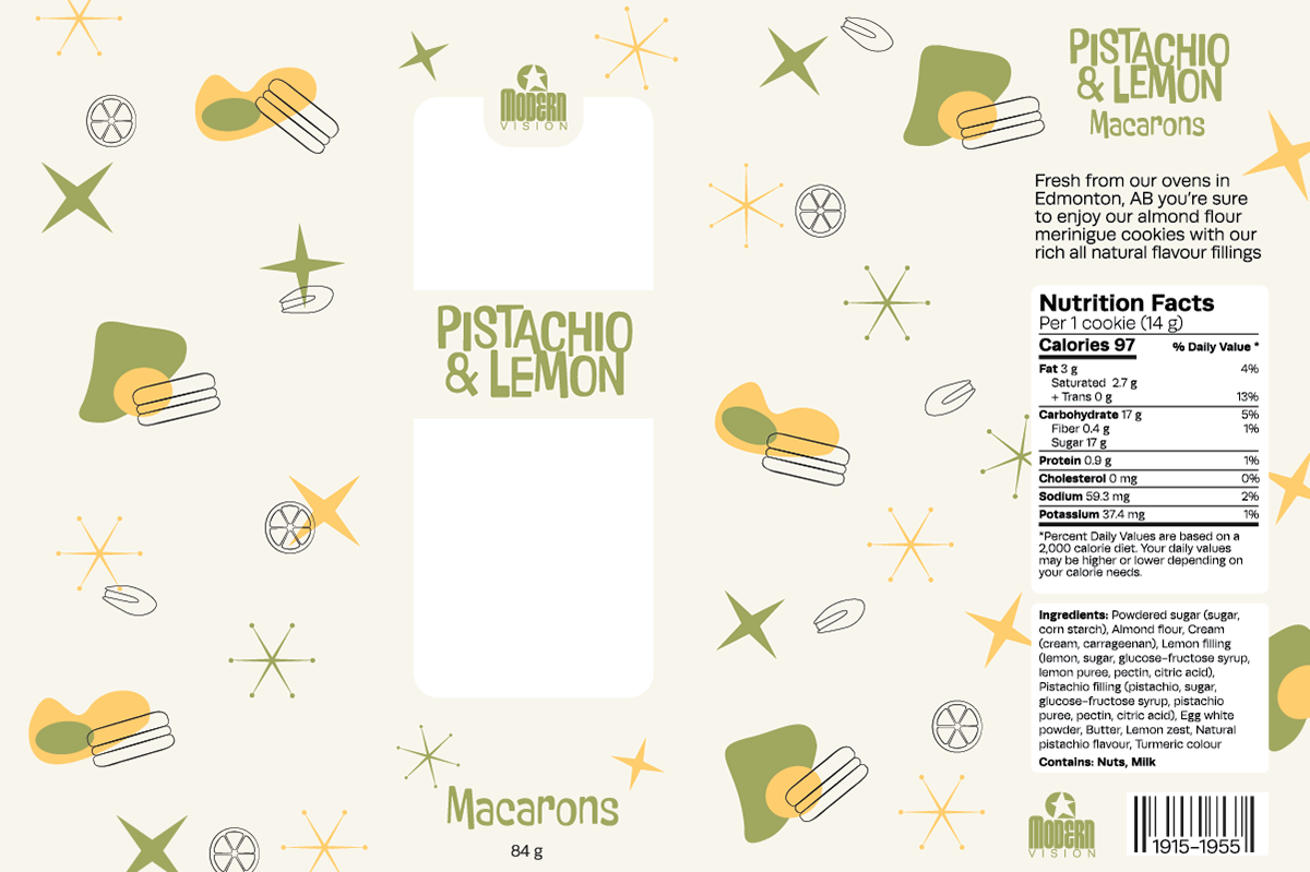

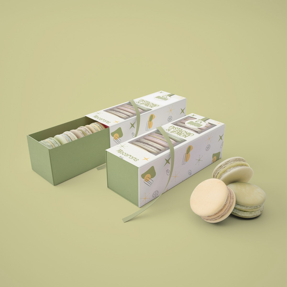
The colour palette, a harmonious symphony of orange, olive, soft pink, yellow, and teal, evokes feelings of warmth, elegance, and joy. These hues intertwine seamlessly, painting a portrait of an era that is both vibrant and timeless.
At the heart of this packaging concept lies an ode to retro design – a fusion of elements that resurrects the past and intertwines it with contemporary allure. This portfolio entry doesn't just showcase packaging; it narrates a story of nostalgia, flavour, and aesthetic finesse. It's an invitation to relive the past, even as we embrace the present.

This compact insert not only showcases the delightful range of flavours but also provides a playful way to connect on social media, all while encapsulating the same retro-inspired illustrations and colours that define our product packaging.