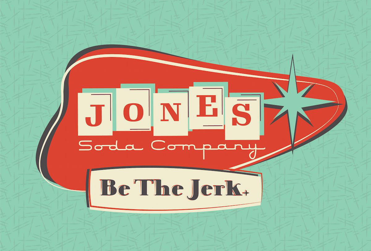
Jone's Soda Retro Rebrand
This class project involved rebranding an existing beverage company in the 1950s design style, which has always been a personal favourite of mine. I found this to be one of the most interesting and enjoyable projects I have worked on. Drawing inspiration from the Atomic Era design and Googie Architecture, I created a cohesive brand that can be seamlessly applied to all branding elements and future applications. The end result is a unique and memorable brand identity that stands out from the competition. Overall, this was a challenging and rewarding project that allowed me to showcase my passion for 1950s design in a practical setting.
Software used: Adobe Illustrator, Adobe Photoshop
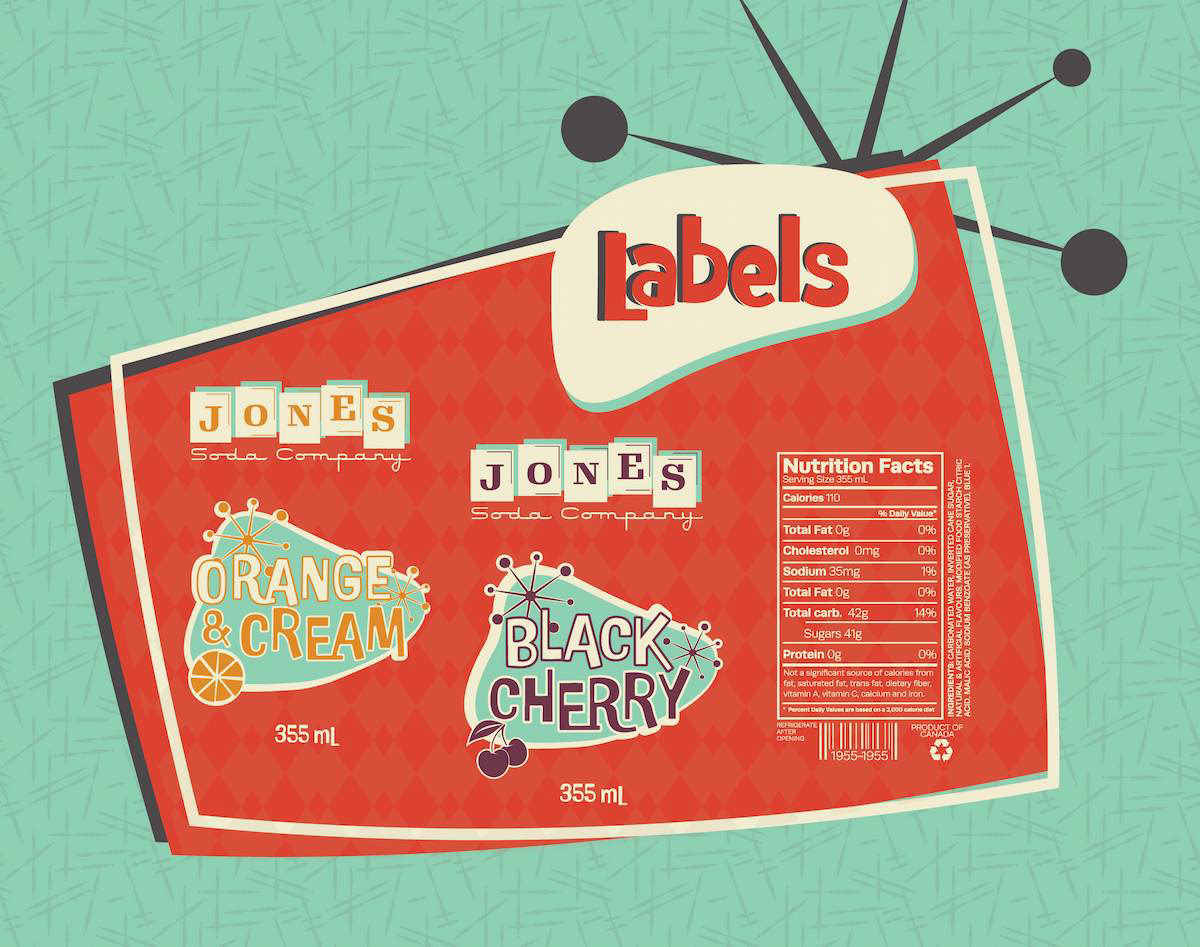
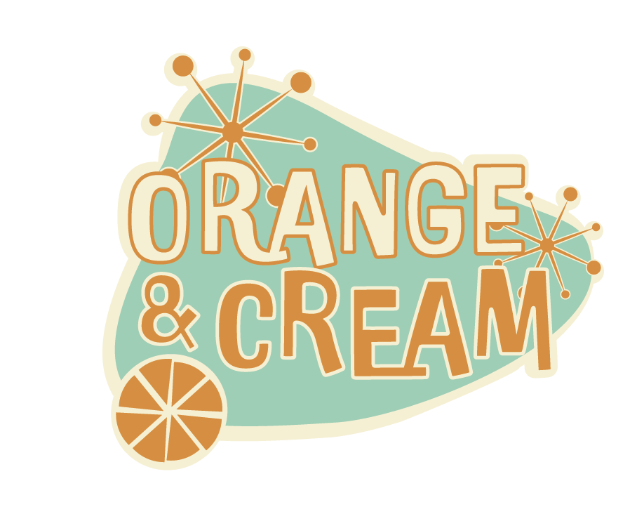
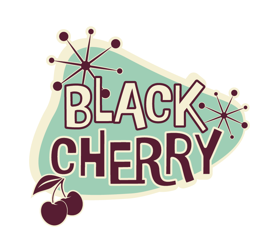
The label design for this project is aimed to be eye-catching, fun, and memorable, with the goal of differentiating the beverage from competitors and attracting customers' attention on store shelves. The labels are designed to be directly printed on the bottle, which gives them a nostalgic feel that further enhances the brand identity.
The brand's consistency is maintained throughout the labels while still allowing individual flavours to be highlighted by incorporating distinct titles, colours, and simple fruit illustrations. This approach ensures that the customer can easily recognize the brand while also being able to quickly identify their desired flavour.
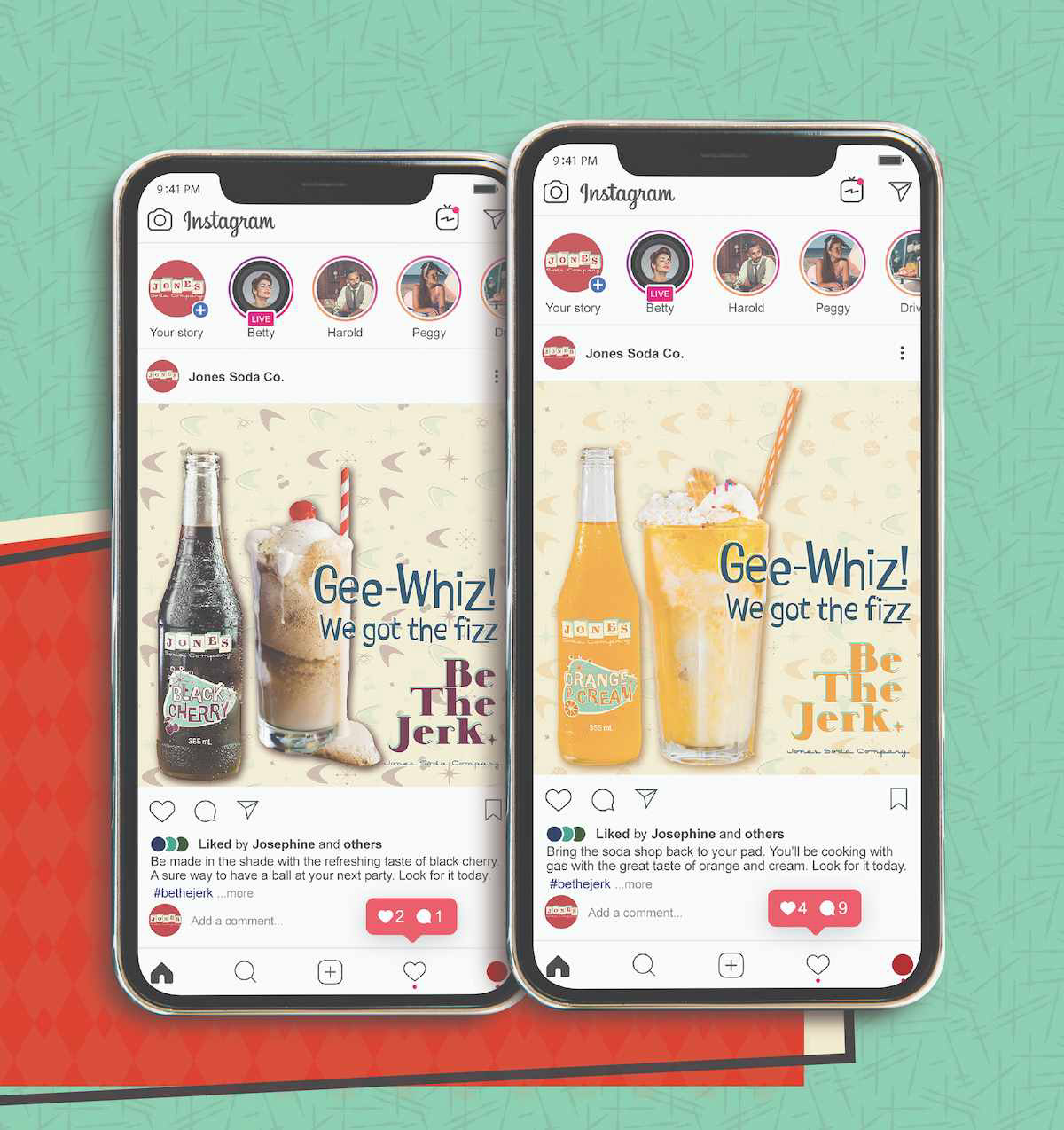
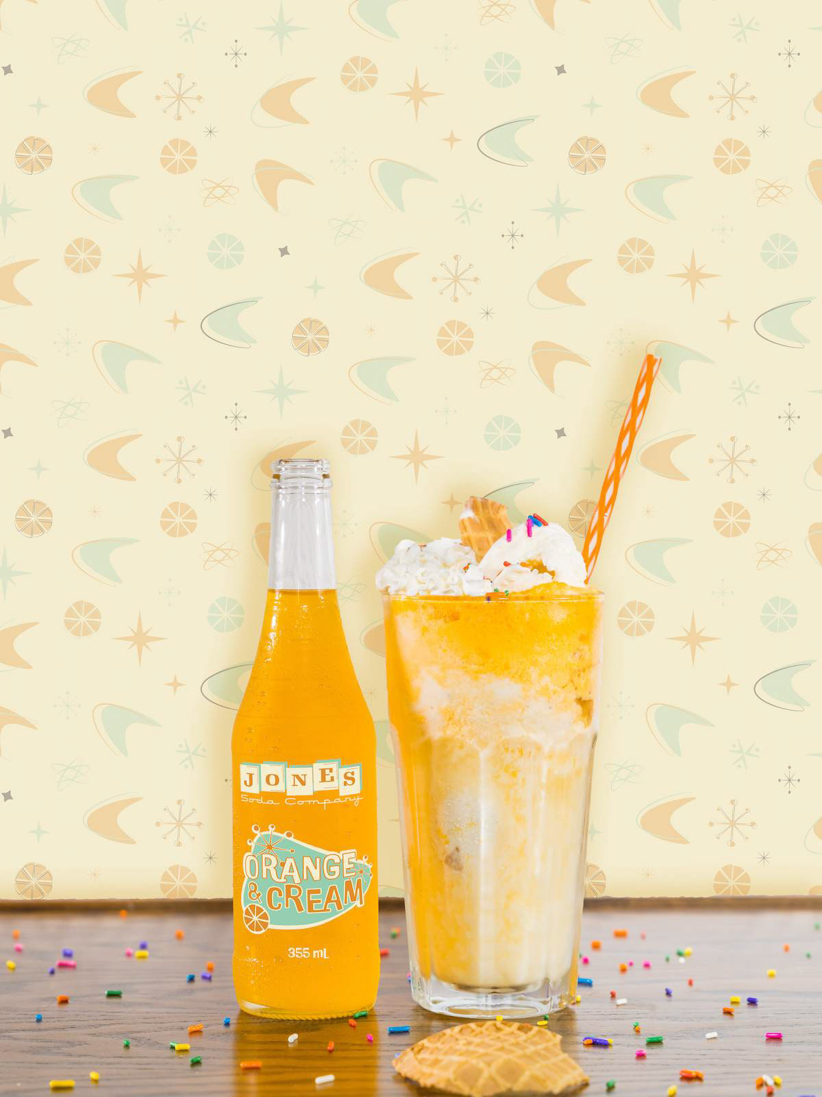
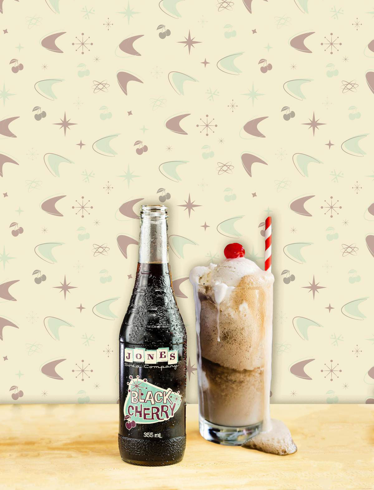
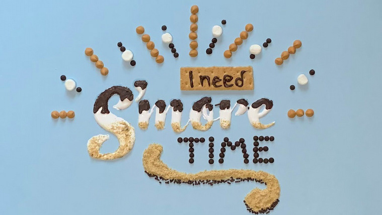
In addition to the packaging design, I also created an Instagram-based ad campaign for the rebranded beverage company. The 1950s saw a decline in the popularity of soda fountain counters, where people would order a variety of shakes, malts, and floats. To tap into this trend, the "Be The Jerk" campaign invites customers to purchase the soda and create these drinks at home.
To create a cohesive and visually appealing campaign, I designed a background pattern that can be easily adjusted to reflect the soda flavour being highlighted in the ad. This approach ensures that each ad is unique, while still maintaining the brand identity across all marketing materials.
By using Instagram as the primary platform for the campaign, the brand can effectively reach a younger demographic and tap into the nostalgia associated with 1950s design. Overall, this campaign effectively combines both practicality and visual appeal to create a standout brand identity that is both memorable and effective in reaching its target audience.